5
$\begingroup$

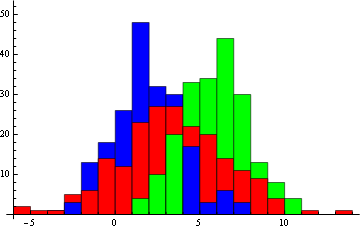
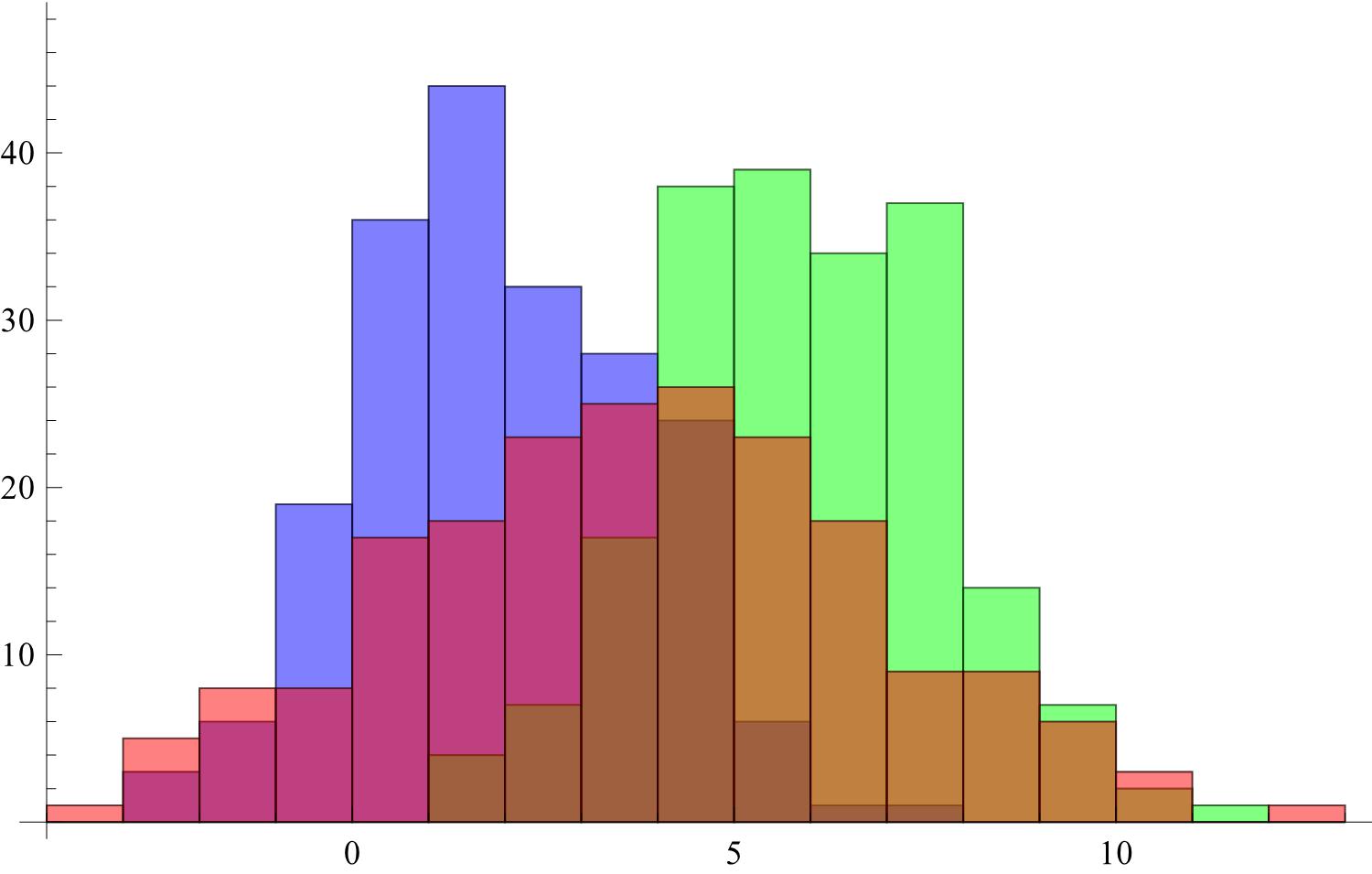
I am trying to visualise multiple data sets in one histogram. When using one or two datasets, the automatic transparency of the bars keeps everything relatively easy to see. When going to three or more datasets however, quickly the colours become confusing and unclear, in particular when there is much overlap.

data = {RandomVariate[NormalDistribution[2, 2], 200], 
   RandomVariate[NormalDistribution[6, 2], 200], 
   RandomVariate[NormalDistribution[4, 3], 200]};
Histogram[data, ChartStyle -> {Blue, Green, Red}]

enter image description here

Instead of the transparency and the overlay of the colours, one can disable the transparency. The result of this however is that smaller bars can get hidden behind larger ones. Is there a way to make sure that the smallest bar in a certain bin is always in front of the larger ones? I have looked but all I found is the "Stacked" option of ChartLayout which is not what I am looking for.

$\endgroup$
3
  • $\begingroup$ What about a 3D histogram? Histogram3D[MapIndexed[{First@#2, #1} &, data, {2}], ChartStyle -> {Blue, Green, Red}] $\endgroup$
    – Jason B.
    Commented Mar 11, 2016 at 11:13
  • $\begingroup$ Although neat for use inside of Mathematica, I want to use the plots for reports and presentations as well so a 2D solution would be highly preferable. The closest solution I found is the line method mentioned here where only EdgeForm is used. Ideally I would have something like that where the bars are filled and ordered front to back from small to large $\endgroup$
    – Maarten
    Commented Mar 11, 2016 at 11:30
  • 1
    $\begingroup$ A much, much better option (for even just 1 data set) is SmoothHistogram (see answer from @AndyRoss at mathematica.stackexchange.com/a/2316/19758) and/or SmoothKernelDistribution (if you want to do more than just display the distribution). $\endgroup$
    – JimB
    Commented Mar 11, 2016 at 13:49

3 Answers 3

3
$\begingroup$
k = Histogram[Tooltip[#, False] & /@ data, ChartStyle -> {Blue, Green, Red}]

(k /. {_[_[{_[_[_[{_, RectangleBox[a___]}]], _]}, _], _]} :> Rectangle[a]) /. 
{_[___, _[c : RGBColor[__]]], b : {Rectangle[__] ..}} :> Thread[{c, b}] /.
{{{}, s : {{RGBColor[__], Rectangle[__]} ..}, __}} :> s /.
{s : {RGBColor[__], Rectangle[__]} ..} .. :> s /. 
s : {{RGBColor[__], Rectangle[__]} ..} :> 
                           (SortBy[#, -#[[2, 2, 2]] &] & /@ GatherBy[s, #[[2, 1]] &])

Mathematica graphics

$\endgroup$
7
  • $\begingroup$ I must confess, I find having this many histograms overlaid in one chart to be quite confusing… $\endgroup$ Commented Mar 11, 2016 at 12:43
  • $\begingroup$ @J.M. You should take a look at my meeting notes to gain some courage $\endgroup$ Commented Mar 11, 2016 at 12:46
  • $\begingroup$ Okay, you beat me in the code-golf here lol $\endgroup$
    – Jason B.
    Commented Mar 11, 2016 at 12:49
  • 1
    $\begingroup$ @JasonB Shorter,but no axes Graphics[{EdgeForm[Black], Cases[k, RGBColor[___] | p : RectangleBox[___], Infinity] /. RectangleBox -> Rectangle //. {x___, RGBColor[___], b : RGBColor[__], y___} :> {x, b, y}}, AspectRatio -> 1] $\endgroup$ Commented Mar 11, 2016 at 13:31
  • $\begingroup$ @JasonB Sometimes Mathematica needs to be driven like a Ferrari $\endgroup$ Commented Mar 11, 2016 at 13:41
2
$\begingroup$

So I dug up a function I had written to create a custom histogram, and have modified it to do the task here.

sortedHistogram[data_, colorlist_, labellist_, 
  plotopts : OptionsPattern[]] := 
 Module[{bins, bincounts, width, rectangles},
  (* Check that you have given a color and label for each data set *)

    If[Not@SameQ[Length[data], Length@colorlist, Length@labellist],
   Print["List dimensions not equal"];
   Abort[];
   ];
  (*Next we get the bins that would result from doing a histogram on \
the entire data set *)
  bins = HistogramList[Flatten@data][[1]];
  (* Then we get the bincounts for the individual data sets *)

  bincounts = Last@HistogramList[#, {bins}] & /@ data;
  width = First@Differences@bins;
  (* Create an array of rectangles *)

  rectangles = 
   Function[{color, 
      heights}, {EdgeForm[Black], color, 
        Rectangle[{#1 - 0.5 width, 0}, {#1 + 0.5 width, #2}]} & @@@ 
      Transpose[{Mean /@ (Partition[bins, 2, 1]), heights}]] @@@ 
    Transpose[{colorlist, bincounts}];
  (* Then sort them, putting the smallest in front.  
  This involves a transpose, sort, transpose sequence *)

  rectangles = 
   Transpose[
    Sort[#, #1[[3, 2, 2]] > #2[[3, 2, 2]] &] & /@ 
     Transpose[rectangles]];
  (* Now we show the data, and I've included the legend by default *)

    Legended[
   Show[Graphics /@ rectangles, plotopts, Frame -> True, 
    AspectRatio -> 0.7],
   SwatchLegend[colorlist, labellist]
   ]
  ];

We'll try it on some test data,

data = RandomVariate[NormalDistribution[#1, #2], 300] & @@@ {{2, 
     2}, {6, 2}, {4, 3}, {0, 4}};

This is the default histogram,

Histogram[data, ChartStyle -> {Red, Blue, Green, Purple}]
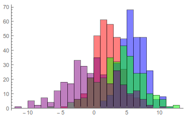
enter image description here

And here is the sorted histogram,

sortedHistogram[data, {Red, Blue, Green, Purple}, {"label1", "label2",
   "label3", "label4"}]
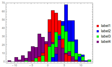
enter image description here

You can give any graphics options to customize the plot,

sortedHistogram[data, {Red, Blue, Green, Purple}, {"label1", "label2",
   "label3", "label4"}, AspectRatio -> .5, ImageSize -> 500, 
 FrameLabel -> {"value", "frequency"}, BaseStyle -> 16]
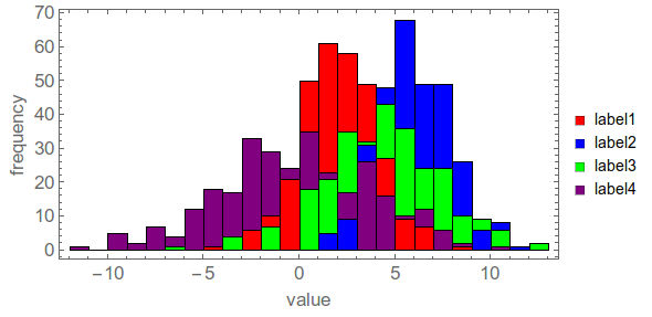
enter image description here

However, the BaseStyle won't apply to the legend labels. To do that you need to give a Style object for the labels. For example instead of {"label1", "label2", "label3", "label4"}, put Style[#, 18, FontFamily -> "Times"] & /@ {"label1", "label2", "label3", "label4"}
$\endgroup$
0
$\begingroup$

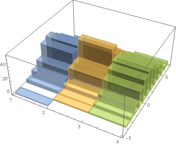
One of the problems with your approach is that sometimes the larger bar and sometimes the smaller bar will be "in front." As such, I prefer seeing the data in 3D, especially for presentations (I can dynamically rotate the 3D figure for my audience) and reports:

z = Table[
   {i, RandomVariate[NormalDistribution[2, 2]]}, {i, 3}, {200}];
Histogram3D[z]

enter image description here

You mentioned the difficulty when there are more than three histograms.

Try this:

Histogram3D@Table[
  {i, RandomVariate[
    NormalDistribution[RandomReal[30], RandomReal[10]]]}, 
  {i, 10}, {200}]

or better yet:

mymeans = RandomReal[{1, 20}, 10];
mystandarddevs = RandomReal[{5, 20}, 10];
myfig = Histogram3D@Table[
   {i, RandomVariate[
     NormalDistribution[mymeans[[i]], mystandarddevs[[i]]]]}, 
   {i, 10}, {200}]
$\endgroup$

Your Answer

By clicking “Post Your Answer”, you agree to our terms of service and acknowledge you have read our privacy policy.

Not the answer you're looking for? Browse other questions tagged or ask your own question.