7
$\begingroup$

I'm new to Mathematica and I am using it as a free trial online.

I am doing a biology experiment, varying the composition of people's diet and seeing the effect of that on sleep. Because I am varying macronutrient break down, I have a three part system. (eg. 50% protein, 30% carbohydrates, 20% fat etc). I can denote this percentage diet break down on a ternary plot.

I then want to extend this into 3D space because my dependent variable is sleep duration etc - how can I plot this 'y' value for a corresponding point on the ternary plot?

eg. 7 hours sleep corresponds to 50:30:20, 8 hours sleep corresponds to 40:20:40 etc

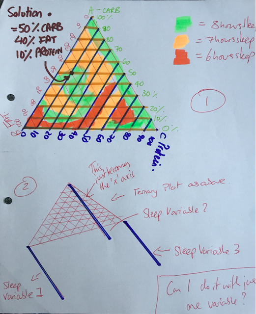
Appreciate I may not have been the clearest, so happy to explain things again if needs-be! In an attempt to make some thing clearer, I am attaching a hand drawn picture of what I think I want!

enter image description here

There are a couple of different ways I can visualise it in my head:

In the first idea - I have a density plot, with, for example, three different qualities of sleep.

In the second idea, the whole ternary plot becomes sort of an x axis? I then extend into the 3D plane with my sleep variable...this would be like a normal 'y' axis, i.e. the higher you go, the higher the number. Would it be possible to do this with just one sleep variable or would it have to be done with a minimum of two sleep variables? If it needs more than one sleep variable that is fine too, because I have for example, time it takes to get to sleep and deep sleep percentage too, which I could put on the same graph.

Hopefully my 'triangular prism' reference is starting to make sense now!!

$\endgroup$
14
  • 1
    $\begingroup$ Possibly related 39733? $\endgroup$
    – Tim Laska
    Commented May 29, 2020 at 3:07
  • $\begingroup$ Hello, welcome to Mathematica.SE. Then, do you mean something like this?: mathematica.stackexchange.com/q/195633/1871 $\endgroup$
    – xzczd
    Commented May 29, 2020 at 3:07
  • $\begingroup$ Hi @TimLaska - many thanks it is like that - only, I wanted to work out a way how to plot a graph like that in 3D (because of my fourth variable sleep duration). I don't know how to do that on Mathematica online. can you help with this? For example, to start with, I am unable to make a table of data with my four variables... $\endgroup$
    – Rushi
    Commented May 29, 2020 at 13:13
  • $\begingroup$ xzczd - thanks - I did look at that thread but it wasn't useful for what I wanted $\endgroup$
    – Rushi
    Commented May 29, 2020 at 13:13
  • $\begingroup$ @xzczd I am new to Mathematica online so am unable to navigate myself around the program $\endgroup$
    – Rushi
    Commented May 29, 2020 at 13:13

1 Answer 1

3
$\begingroup$

I'll start by making a random dataset. Here we take 2 random numbers for the first two variables then set the third such that $a+b+c=1$ to be consistent with a Ternary plot. Here $a,b,c$ correspond to carbs, fat, protein respectively. We take the 4th variable to be another independent random number which corresponds to sleep for your case. Lastly we select only the data where $\{a,b,c\}>0$

data = Select[Table[
{a, b, 1 - a - b, RandomReal[]} /. {a -> RandomReal[], b -> RandomReal[]}, {i, 5000}],
 # == Abs[#] &];

We'll want to define our transformation from 3 variables down into our triangular 2D grid and convert our data over. This I just pull directly from Wikipedia.

toGrid[p_] := 1/2 {2 p[[2]] + p[[3]], Sqrt[3] p[[3]]};
dataPts = {10 toGrid[Most@#], Last@#} & /@ data;

Next we'll define some quantities to draw our triangular grid with

pts3D = Select[Tuples[Range[0, 10], {3}], #[[1]] + #[[2]] + #[[3]] == 10 &];
pts = toGrid /@ pts3D;
ptsG = Table[toGrid /@ Select[pts3D, #[[i]] == 0 &], {i, 3}];
lines = {Thread[{ptsG[[1]], ptsG[[2]]}], 
   Thread[{ptsG[[2]], ptsG[[3]]}], 
   Thread[{ptsG[[1]], Reverse[ptsG[[3]]]}]};

Add some styling and text to spruce it up

st[sz_] := Style[#, Black, Bold, FontFamily -> "Times", sz] &;
rot = 60 Degree;
ticks = st[12] /@ Table[10 i, {i, 0, 10}];
labels = {Rotate[Text[st[16]["Carbs"], {1.5, 5}], rot],
   Text[st[16]["Fats"], {5, -1}],
   Rotate[Text[st[16]["Protein"], {8.5, 5}], -rot]};
mkTicks[ind_, ang_, off_] := Table[
Rotate[Text[If[ind == 2, Reverse[ticks], ticks][[i]], 
    ptsG[[ind, i]] + off], ang], {i, Length[ticks]}]

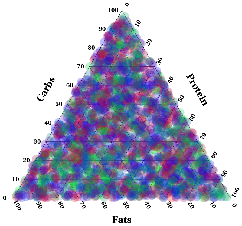
Finally draw it! Here sleep is a number between 0 and 1 with 0 being red, 1/2 being blue, 1 being green and anything in between a proportional blend between the 3.

Graphics[{Point /@ pts, labels, Line /@ lines, mkTicks[1, rot, {1/4, 1/4}],
 mkTicks[2, 0, {-2/5, 0}], mkTicks[3, -rot, {1/5,-1/3}], Opacity[0.25],
 {FaceForm@Blend[{Red, Blue,Green}, #[[-1]]], Disk[#[[1]], 0.2]} & /@ dataPts}]

Obviously a non-random dataset should show some more revealing patterns. In my experience 3D graphs are really hard to make look nice and convey the data in a digestible way, I think this way should work nicely.

Graph

edit:

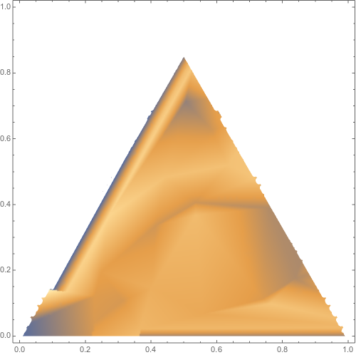
Here's some quick and dirty code for an idea of a DensityPlot. Because my data is random it looks mostly like a solid block of color. You can clean it up and add all the axes and stuff if you like.

int = Interpolation[dataPts, InterpolationOrder -> 1];
dataInt[x_, y_] = If[y < Sqrt[x^2 + y^2] Sin[rot] && y < Sqrt[(1 - x)^2 + y^2] Sin[rot],int[x, y], I];
plt2 = DensityPlot[dataInt[x, y], {x, 0, 1}, {y, 0, 1}]

DenGraph

$\endgroup$
12
  • $\begingroup$ Many thanks for this - it does seem to be similar to what I had in mind. Just to clarify, would I be able to do this on wolfram.com/mathematica/trial? Secondly, if I now wanted to use my own data, rather than a random data set, how could I input this data set ? Finally, I appreciate that a 3D graph will be messy!, If however, I want to show continuous change, as in a 2D line graph, interpolating the data points, then I might need to have a 3D graph - would it be possible to get some advice on this as well to see how complicated and convoluted it may seem! Many thanks. $\endgroup$
    – Rushi
    Commented May 30, 2020 at 9:55
  • $\begingroup$ You can copy and paste the code into wolfram.com/mathematica/trial to see if it works. Import your own data with an Import statement (reference.wolfram.com/language/ref/Import.html). You can interpolate easily with Interpolation (reference.wolfram.com/language/ref/Interpolation.html). You can do this and use a DensityPlot to still use a 2D color graph or I suppose a 3D one. I actually did this with the sample data above but was unimpressed by the result. Perhaps if your data is well structured it'd come out nice. See edit for details. $\endgroup$
    – bRost03
    Commented May 30, 2020 at 13:34
  • $\begingroup$ many thanks - I tried to do the import but it didn't work - is there a way I can manually enter my data ? When I googled this, It said to use control comma to do a new column but this didn't work on my Mac - have I got this correct? $\endgroup$
    – Rushi
    Commented May 30, 2020 at 15:09
  • $\begingroup$ What kind of file is your data stored in? If you can host it online and share it with me I can show you how to import it. $\endgroup$
    – bRost03
    Commented May 30, 2020 at 15:25
  • $\begingroup$ Right now it is on excel but I could try some other method too - how do I share it with you? $\endgroup$
    – Rushi
    Commented May 30, 2020 at 15:36

Your Answer

By clicking “Post Your Answer”, you agree to our terms of service and acknowledge you have read our privacy policy.

Not the answer you're looking for? Browse other questions tagged or ask your own question.