1
$\begingroup$

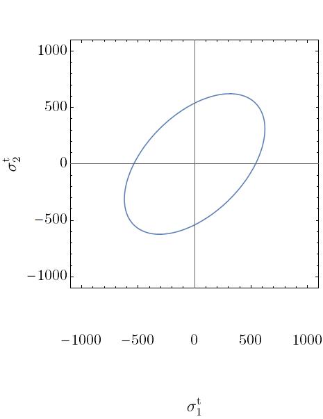
I just download the Modern Latin Math font from here to have a consistent font with my LaTeX text. The font is exactly what I am looking for. But when I use it for my plot it messes the gap between the axis and the tickmarks and also between the tickmarks and the frame label.

This is the command that I use

ListLinePlot[stressD1, AspectRatio -> 1, Frame -> True, 
 PlotRange -> {{-1100, 1100}, {-1100, 1100}}, FrameStyle -> Black, 
 BaseStyle -> {FontFamily -> "Latin Modern Math", FontSize -> 22}, 
 ImageSize -> 465, 
 FrameLabel -> (MaTeX[#, 
      Magnification -> 2] &) /@ {"\\sigma^\\text{t}_{1}", 
    "\\sigma^\\text{t}_{2}"}]

and this is what I get

enter image description here

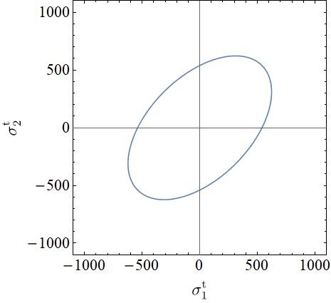
However, if I use any other fonts, e.g. the MS Serif font, the plot is totally fine, see below

ListLinePlot[stressD1, AspectRatio -> 1, Frame -> True, 
 PlotRange -> {{-1100, 1100}, {-1100, 1100}}, FrameStyle -> Black, 
 BaseStyle -> {FontFamily -> "MS Serif", FontSize -> 22}, 
 ImageSize -> 465, 
 FrameLabel -> (MaTeX[#, 
      Magnification -> 2] &) /@ {"\\sigma^\\text{t}_{1}", 
    "\\sigma^\\text{t}_{2}"}]

enter image description here

Any suggestions on how to fix this?

$\endgroup$
7
  • $\begingroup$ What is your OS and Mathematica version? $\endgroup$
    – Szabolcs
    Commented Jul 7, 2019 at 17:38
  • 1
    $\begingroup$ @Szabolcs Window 10 mathematica 11.3 $\endgroup$
    – KratosMath
    Commented Jul 7, 2019 at 19:49
  • $\begingroup$ I don't know why, but here are some things I would try: 1. Try this version of the fonts 2. Try the "Roman" version (not "Math"). 3. As I remember, on Windows the correct name to refer to the font was "LM Roman 12" and not "Latin Modern Roman" or "Latin Modern Math", but I can't test this on Windows right now. Will any of these help? I have no idea. Just try them. $\endgroup$
    – Szabolcs
    Commented Jul 8, 2019 at 7:04
  • $\begingroup$ @Szabolcs thanks for your response. I used the font "LM Roman 9", which is practically the same as "Latin Modern Math", and didn't have that issue. $\endgroup$
    – KratosMath
    Commented Jul 8, 2019 at 8:51
  • $\begingroup$ Good to hear! The number in the font name is the size it is optimized for. "LM Roman 9" can be used at any size, not just 9 points, but other variants are more readable at smaller sizes. At larger sizes "LM Roman 12" would look more beautiful. In practice, it doesn't matter which one you use unless you use really tiny sizes. $\endgroup$
    – Szabolcs
    Commented Jul 8, 2019 at 10:02

1 Answer 1

4
$\begingroup$

Following the comment of @Szabolcs, I downloaded the full package of Latin Modern Roman fonts here and tried them one by one to check which is the most similar to "Latin Roman Math". So I found "LM Roman 9" to be the best option for the size of the text that I am interested in.

$\endgroup$

Your Answer

By clicking “Post Your Answer”, you agree to our terms of service and acknowledge you have read our privacy policy.

Not the answer you're looking for? Browse other questions tagged or ask your own question.