20
$\begingroup$

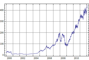
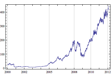
The canonical formatting for date labels in a DateListPlot is for the year or other date label to be centered over the tick at the start of the relevant period.

aapl = FinancialData["AAPL", {2000}];
DateListPlot[aapl, Joined -> True]

canoncial DateListPlot of Apple share price

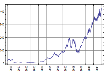
I would like the label to instead be centered on that year, like this.

annual date labels, centered

Relevant facts:

  • I know the font family and size I am using, so specifying offsets for AdjustmentBoxes can be fixed explicitly.
  • Custom functions for the plot are ok, especially if that is necessary to work out how many years there are in the data and therefore how far to offset an AdjustmentBox.
  • I am assuming that the solution is a custom auxiliary function that can be passed to the FrameTicks option. I would be interested to know if that can be specified using SetOptions for DateListPlot instead of doing a custom plotting function.
  • If there are a lot of years in the data, it is ok to specify explicitly that only every $x$th year label is shown. (We have explicit rules for the mapping from number of years to $x$).
  • The partial last year can be specified explicitly by the user. The default would be to show the full year even if there is only a little bit of data for it.

I already have something that works but would be interested in how other people approach it, to see if I can make my solution faster/ more elegant/ more concise. Currently it is a big mess because year labels are not the only option I have implemented.
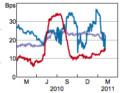
As a bonus, please consider how one would implement labels like this:

two-row date labels

$\endgroup$
0

3 Answers 3

10
$\begingroup$

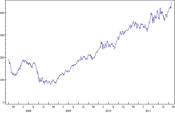
Here is a much simpler solution than Szabolcs's or Mike's. I've directly addressed your second bonus question and this can be easily extended to the first case. The following generates tick marks for the x-axis and incorporates your needs as per yours and Mike's comments below:

  • The quarter label is centered mid quarter
  • The year label is centered mid year

It is a wee bit wasteful in that I generate ticks for all months and then set the ones I don't want to be transparent. Of course, you can build upon the logic and generate/not generate for specific months/dates, but I'll let you decide if its worth it.

xTicks[data_] := Module[{monthStr, date, color},
    monthStr[m_] := Which[
        MemberQ[{2, 5, 8, 11}, m], DateString[# + {0, 1, 0}, "MonthNameInitial"] &, 
        m == 7, DateString[#, {"\n", "Year"}] &, True, "" &
    ];

    color[m_] := If[MemberQ[{4, 7, 10, 1}, m], Black, Transparent];
    date[m_] := If[MemberQ[{2, 5, 8, 11}, m], 15, 1];

    Table[MapAt[monthStr[m], {{y, m, date[m]}, {y, m, date[m]}, {0.0125, 0}, color[m]}, 2], 
        {y, Min[data[[All, 1, 1]]], Max[data[[All, 1, 1]]]}, {m, 1, 12}] ~Flatten~ 1
]

and now plot your FinancialData with ticks generated with the above as:

aapl = FinancialData["AAPL", {2008}];
DateListPlot[#, Joined -> True, FrameTicks -> {xTicks[#], Automatic, False, False}, 
    GridLines -> False]& @ aapl

enter image description here

$\endgroup$
8
  • 1
    $\begingroup$ note that for the final plot the quarter labels need to be centred mid quarter whereas the year label is centred on mid year (June 30, July 1) so DateTicksFormat -> {"MonthNameInitial", "\n", "Year"} does not deliver correct ticks in this case because you don't want "MonthNameInitial" above the "Year". $\endgroup$ Commented Jan 28, 2012 at 0:13
  • $\begingroup$ The label isn't centred on the quarter, but this is a good start. One could set up a function xTicks[data_] := ({{#, 3, 1}, {#, 6, 1}, {#, 9, 1}, {#, 12, 1}} & /@ Range[Min[data[[All, 1, 1]]], Max[data[[All, 1, 1]]]])~Flatten~1 and then have xTicks[data] as the bit in the FrameTicks option. $\endgroup$
    – Verbeia
    Commented Jan 28, 2012 at 0:14
  • $\begingroup$ @MikeHoneychurch Please see my edit. $\endgroup$
    – rm -rf
    Commented Jan 28, 2012 at 4:16
  • $\begingroup$ I'm a bit confused by the x ticks specification. I would expect that to be either xTicks or xTicks[#]&, but not xTicks[#]. Could you explain that? The documentation about using a function for tick specifications is scant. There's one example implying that the function should take two values, the minimum and the maximum value of the range. AFAIK, your version isn't to be found at all, at least, not on the FrameTicks pages. $\endgroup$ Commented Apr 29, 2012 at 11:25
  • $\begingroup$ @Sjo This is a function alright, but it isn't the two argument version in the docs. You use the two argument version when you accept the xmax and xmin that is given as default (or set via PlotRange) and want to style the ticks or space them differently, etc. Using that in this case, would've given only the years as input to the tick function (see default ticks with DateListPlot[aapl]) whereas I also needed the month and date info to position and style it as Verbeia needed. To to this, I pass the actual data that's being plotted and get the year/month/date info from that and create a list. $\endgroup$
    – rm -rf
    Commented Apr 29, 2012 at 15:58
6
$\begingroup$

My approach includes several changes:

Firstly, w.r.t. the ticks in all likelihood you will be using the same or almost the same tick labels for many plots. So therefore it seems more efficient to construct a tick list or maybe 2 or 3 of them and just keep calling that list, rather than keep doing very slow date calculations over and over. Here is an example with major ticks every year, minor ticks every quarter, and the major tick label (the year) centred on July 1. Your last plot had quarter ticks so I thought I would add them.

There may be more direct ways to do this but I have made it line by line to hopefully make it more transparent.

numberOfYears = 20;
years = DatePlus[{1998, 1, 1}, {#, "Year"}] & /@ Range[20];
years = AbsoluteTime /@ years;
major = Transpose[{years, Table["", {20}], 
    Table[{0.01, 0.`}, {20}]}];
quarters = DatePlus[{1998, 1, 1}, {#, "Quarter"}] & /@ Range[80];
midYear = Cases[quarters, {_, 7, 1}];
quarters = DeleteCases[quarters, {_, 7, 1}];
quarters = AbsoluteTime /@ quarters;
yearLabels = ToString /@ midYear[[All, 1]];
midYear = AbsoluteTime /@ midYear;
minor = Join[
   Transpose[{quarters, Table["", {Length[quarters]}], 
     Table[{0.005, 0.`}, {Length[quarters]}]}],
   Transpose[{midYear, yearLabels, 
     Table[{0.005, 0.`}, {Length[midYear]}]}]];
minor = SortBy[minor, First];
ticks = Join[major, minor]

Get some data:

msft = FinancialData["MSFT", "Jan. 1, 2000"]
ibm = FinancialData["IBM", "Jan. 1, 2000"]

(* I've excluded a description of the plot options *)
Timing[DateListPlot[{msft, ibm}, Joined -> True, opts]] 
0.959088

It is much faster to work with AbsoluteTime for date and time series. The plot below is rendered in 0.7sec including all the conversions to absolute time shown next:

Timing[
msft1 = msft;
ibm1 = ibm;
msft1[[All, 1]] = AbsoluteTime /@ msft[[All, 1]];
ibm1[[All, 1]] = AbsoluteTime /@ ibm[[All, 1]];
DateListPlot[{msft1, ibm1}, Joined -> True, opts]]
0.712620
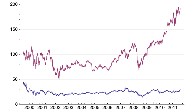
enter image description here

But even more generally, it seems that DateListPlot is just an inefficient function period. We can make an identical plot using ListLinePlot (or ListPlot) much faster:

Timing[ListLinePlot[{msft1, ibm1}, FrameTicks -> {{Automatic, Automatic}, 
{ticks, Automatic}}, opts]

0.120186

(for accurate comparison add ~0.2 sec for the absolute time conversions)

Also it is possible to do these tick creations using a function:

ticks[data_] := Module[{years, quarters},
  years = Switch[Length[Dimensions[data]],
    2, {data[[1, 1, 1]], data[[-1, 1, 1]]},
    3, {Min[data[[All, 1, 1, 1]]], Max[data[[All, -1, 1, 1]]]}
    ];
  quarters = 
   Flatten[{{#, 1, 1}, {#, 4, 1}, {#, 7, 1}, {#, 10, 1}} & /@ (Range @@
        years), 1];
  quarters = AbsoluteTime /@ quarters;
  Transpose[{quarters, 
    Flatten[Table[{"", "", i, ""}, {i, Range @@ years}], 1], 
    Flatten[Table[{{0.01, 0.}, {0.005, 0.}, {0.005, 0.}, {0.005, 
        0.}}, {i, Range @@ years}], 1]}]
  ]

but the point of the current approach is that there is no need/point in recreating the same. or similar, tick lists over and over and over whenever you plot data. Using ListLinePlot with a tick library seems most efficient for regular production plotting of data (with certain date range characteristics).

Edit

Ticks for the bottom plot. Same principle. I have used a line break to make the year labels appear a line below the quarter labels. This is not an exact solution because your requirement is to have the year display at the end of the plot regardless. This can be added in manually or programmatically but for now this is what I have because it is after 10am and I need to be doing other things :)

quarters = DatePlus[{1998, 1, 1}, {#, "Quarter"}] & /@ Range[80];
quarters = AbsoluteTime /@ quarters;
midQuarter = DatePlus[{1998, 2, 15}, {#, "Quarter"}] & /@ Range[80];
midQuarter = AbsoluteTime /@ midQuarter;
yearLabels = Table["\n" <> ToString[i], {i, 1998, 2017}];
yearLabels = Flatten[{"", "", #, ""} & /@ yearLabels];
quarterLabels = Flatten@Table[{"M", "J", "S", "D"}, {20}];
ticks2 = Join[
   Transpose[{midQuarter, quarterLabels, 
     Table[{0., 0.}, {Length[midQuarter]}]}], 
   Transpose[{quarters, yearLabels, 
     Table[{0.005, 0.`}, {Length[quarters]}]}]];
ticks2 = SortBy[ticks2, First];

ListLinePlot[msft1[[-400 ;; -1]], 
 FrameTicks -> {{Automatic, Automatic}, {ticks2, Automatic}}, 
 ImagePadding -> {{50, 10}, {40, 5}}, opts]
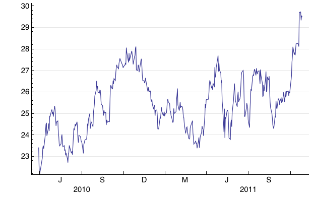
enter image description here

In summary my approach to this, given that I already know a little bit about what you want to do, is to create a "library" of tick lists that you can call for each particular data set with minimal dynamic modification to the list if an when required; and to use ListLinePlot instead of DateListPlot.
$\endgroup$
4
  • $\begingroup$ I'm wondering how to cause the tick labels to be shifted down, so we can make this too: i.sstatic.net/h2TBH.png $\endgroup$
    – Szabolcs
    Commented Jan 27, 2012 at 22:39
  • $\begingroup$ working on that at the moment. My approach will be to make the numbers strings and add a line break or maybe two. $\endgroup$ Commented Jan 27, 2012 at 22:46
  • $\begingroup$ Some years ago I remember I figured it out, but I forgot and can't find the notebook ... I'm sure there's a better way than using newlines. Gotta sleep now though. $\endgroup$
    – Szabolcs
    Commented Jan 27, 2012 at 22:50
  • $\begingroup$ adras.com/… $\endgroup$
    – Szabolcs
    Commented Jan 27, 2012 at 22:54
5
$\begingroup$

This is the obvious solution, but it requires a lot of fussing with the details. I hope that you can use my code as a starting point. I am explicitly using years as the basic unit, so the code I give only works well if the data spans several years.

aapl = FinancialData["AAPL", {2000}];

(* extract start and end years  *)
{startYear, endYear} = aapl[[{1, -1}, 1, 1]]

(* these are tick mark and grid line locations *)
marks = Range[startYear, endYear];

(* these are label locations (all on Jul 1); 
   I only show every second year for lack of space, 
   change it to fit your needs *)
labels = Table[{{year, 7, 1}, year, 0}, {year, startYear, endYear, 2}];

DateListPlot[aapl, Joined -> True, 
 GridLines -> {List /@ marks, Automatic},
 FrameTicks -> {
   Join[labels, {{#, 1, 1}, Null} & /@ marks],
   Automatic,
   {{#, 1, 1}, Null} & /@ marks,
   Automatic}]

Mathematica graphics

You can consider rotated labels for better space usage:

labels = Table[{{year, 7, 1}, Rotate[year, 90 Degree], 0}, 
            {year, startYear, endYear}];

Mathematica graphics

$\endgroup$
3
  • $\begingroup$ Why June 15 not 30? These aren't quite centred on the year. $\endgroup$
    – Verbeia
    Commented Jan 28, 2012 at 0:17
  • $\begingroup$ You are right, it should be {year, 7, 1} ... wrote it at to late at night ... $\endgroup$
    – Szabolcs
    Commented Jan 28, 2012 at 13:29
  • $\begingroup$ Updated, including images. I believe the imperfect centring of the rotated labels is due to the position of the baseline for the font used. BTW I hadn't the slightest idea what MJSD were before I looked them up ... (my naive mind would expect Sp, Su, Au, Wi :) $\endgroup$
    – Szabolcs
    Commented Jan 28, 2012 at 13:36

Your Answer

By clicking “Post Your Answer”, you agree to our terms of service and acknowledge you have read our privacy policy.

Not the answer you're looking for? Browse other questions tagged or ask your own question.