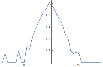
I want to plot the data that I got from measuring the angular dependency of the radiation intensity of a microwave emitter.
My data:
data = {
  {-90, 0}, {-85, 0.15}, {-80, 0}, {-75, 0}, {-70, 0}, {-65, 0}, {-60, 0.2},
  {-55, 0}, {-50, 0}, {-45, 0.275}, {-40, 0.225}, {-35, 0.425}, {-30, 0.55},
  {-25, 0.65}, {-20, 0.75}, {-15, 0.85}, {-10, 0.9}, {-5, 1}, {0, 0.975},
  {5, 0.9}, {10, 0.8}, {15, 0.725}, {20, 0.635}, {25, 0.475}, {30, 0.425},
  {35, 0.2}, {40, 0.15}, {45, 0.175}, {50, 0.15}, {55, 0}, {60, 0}, {65, 0},
  {70, 0}, {75, 0}, {80, 0}, {85, 0}, {90, 0}
}

As you can see my data ranges from -90 to 90 degree in 5 degree steps.
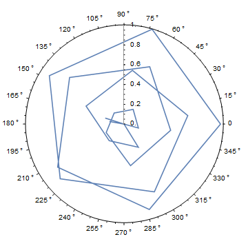
Now, if I try to plot this using ListPolarPlot[] it gets kind of messy:
ListPolarPlot[data,
  PolarAxes -> True, PolarTicks -> {"Degrees", Automatic}, Joined -> True]

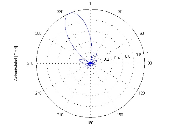
It should look somewhat like this:

What do I have to do to achieve thisget a proper polar plot?
