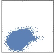
Consider the following scatterplot of a 50K-point dataset:
ListPlot[data,
 AspectRatio -> Automatic, PlotRange -> {{x0, x1}, {y0, y1}},
 ImageSize -> Small,
 Frame -> True,
 FrameTicksStyle -> Directive[FontOpacity -> 0, FontSize -> 0]]

The color quickly saturates as one moves from the edge of the distribution to its center. As a result, most of the density information is lost.
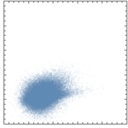
One can remedy this slightly by assigning an opacity below 1 to the points:
ListPlot[data,
 PlotStyle -> Opacity[0.05],
 AspectRatio -> Automatic,
 PlotRange -> {{x0, x1}, {y0, y1}}, ImageSize -> Small,
 Frame -> True,
 FrameTicksStyle -> Directive[FontOpacity -> 0, FontSize -> 0]]

But this solution still has a couple of shortcomings:
- its dynamic range is still fairly narrow (even though it's wider than it was before); thus, most of the data cloud is still shows as saturated color;
- there's no explicit quantitative scale (e.g. a colorbar) tying colors (or in this case, shades) to densities;
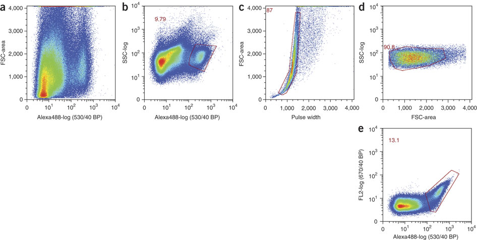
The dynamic range problem could be solved by using more hues. This is what's routinely done when plotting flow cytometry data. For example:

(IMO, the plots in the last set would be improved if they included a color key, showing the correspondence between colors and densities.)
My question is how can I provide such quantitative density information in these scatterplots using Mathematica?
