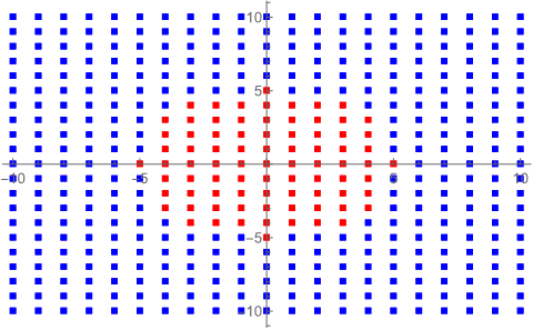
I have a dataset consisting of points on the plane and a corresponding color. These colors divide the plane into a few distinct regions. I would like to make a plot or diagram that nicely shows this breakdown into colored regions.
To generate some example data,
incircle[x_, y_] := Piecewise[{{Red, x^2 + y^2 <= 25 }, {Blue, x^2 + y^2 > 25 }}];
data = Table[{i, j, incircle[i, j]}, {i, -10, 10, 1}, {j, -10, 10, 1}];
data = ArrayReshape[data, {441, 3}];

(*{{-10,-10,Blue},{-10,-9,Blue},{-10,-8,Blue},{-10,-7,Blue},...*)
This gives a list where each entry is a pair of x,y coordinates, and then red or blue depending on whether or not the coordinates are within a circle of radius five.
I can then make a list of coordinates and list of colors, and plot them accordingly using listplot:
pdat = {{#[[1]], #[[2]]}} & /@ data;
pcol = #[[3]] & /@ data;
ListPlot[pdat, PlotStyle -> pcol, PlotMarkers -> "\[FilledSquare]", ImageSize -> {250, 250}]
Which gives me a red circular region. Is there anyway to color each region according to the list more nicely and continuously, preserving a definite boundary between each region? My actual data is much more sporadic so the boundary between regions can be much more complex than a circle.

