added 59 characters in body
Source Link
Chris K
  • 20.4k
  • 3
  • 39
  • 75

Here's an alternative visualization that uses ListPlot with a very low Opacity:

ListPlot[Table[Evaluate[{x2[t], y2[t]} /. soldp], {t, 0, 15000, 0.01}], 
  PlotStyle -> {Black, Opacity[0.002], PointSize[0.005]}]
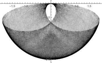
Mathematica graphics

Otherwise, SmoothKernelDistributionSmoothKernelDistribution has two options for smoothing kernels that seem potentially useful if they could only be combined -- "Bounded" and "Radial".

d = SmoothKernelDistribution[
  Map[Function[Evaluate[{x2[#], y2[#]} /. soldp]], Range[0, 15000, 0.025]], 
  Automatic, {"Bounded", {{-2, 2}, {-2, 0}}, "Gaussian"}];

ContourPlot[PDF[d, {x, y}], {x, -2, 2}, {y, -2, 0.1}, MaxRecursion -> 3, PlotPoints -> 50]
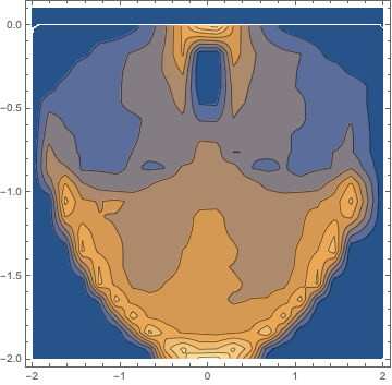
Mathematica graphics

d = SmoothKernelDistribution[
  Map[Function[Evaluate[{x2[#], y2[#]} /. soldp]], Range[0, 15000, 0.025]],
  Automatic, {"Radial", "Gaussian"}];

ContourPlot[PDF[d, {x, y}], {x, -2, 2}, {y, -2, 0.1}, MaxRecursion -> 3, PlotPoints -> 50]
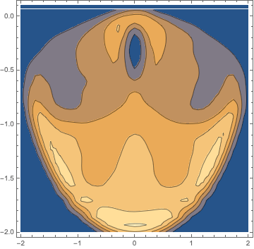
Mathematica graphics

Those are both kind of horrifying. Maybe the general kernel specification func could be pressed into service by someone smarter than me!

Addendum:

Maybe a trip through polar coordinates makes the "Bounded" option more useful. (I wonder if this needs to be corrected for the effect of changing the area of different volumes of phase space...)

dat = Map[Function[Evaluate[{x2[#], y2[#]} /. soldp]], Range[0, 15000, 0.025]];
pdat = ToPolarCoordinates[dat];
d = SmoothKernelDistribution[pdat, Automatic,
  {"Bounded", {{0, 2}, {0, 2 \[Pi]π}}, "Gaussian"}];
ContourPlot[Evaluate[PDF[d, {r, \[Theta]θ}] /. {r -> Sqrt[x^2 + y^2], \[Theta]θ -> ArcTan[x, -y]}],
  {x, -2, 2}, {y, -2, 2}, PlotPoints -> 200, Contours -> 10, PlotRange -> {0, All}]
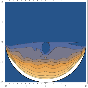
Mathematica graphics

Getting better, but still kind of hideous! Polar ContourPlot thanks to this old answer by @rcollyer (with an extra minus sign before y, because ???)

Here's an alternative visualization that uses ListPlot with a very low Opacity:

ListPlot[Table[Evaluate[{x2[t], y2[t]} /. soldp], {t, 0, 15000,0.01}], 
  PlotStyle -> {Black, Opacity[0.002], PointSize[0.005]}]

Mathematica graphics

Otherwise, SmoothKernelDistribution has two options for smoothing kernels that seem potentially useful if they could only be combined -- "Bounded" and "Radial".

d = SmoothKernelDistribution[
  Map[Function[Evaluate[{x2[#], y2[#]} /. soldp]], Range[0, 15000, 0.025]], 
  Automatic, {"Bounded", {{-2, 2}, {-2, 0}}, "Gaussian"}];

ContourPlot[PDF[d, {x, y}], {x, -2, 2}, {y, -2, 0.1}, MaxRecursion -> 3, PlotPoints -> 50]

Mathematica graphics

d = SmoothKernelDistribution[
  Map[Function[Evaluate[{x2[#], y2[#]} /. soldp]], Range[0, 15000, 0.025]],
  Automatic, {"Radial", "Gaussian"}];

ContourPlot[PDF[d, {x, y}], {x, -2, 2}, {y, -2, 0.1}, MaxRecursion -> 3, PlotPoints -> 50]

Mathematica graphics

Those are both kind of horrifying. Maybe the general kernel specification func could be pressed into service by someone smarter than me!

Addendum:

Maybe a trip through polar coordinates makes the "Bounded" option more useful. (I wonder if this needs to be corrected for the effect of changing the area of different volumes of phase space...)

dat = Map[Function[Evaluate[{x2[#], y2[#]} /. soldp]], Range[0, 15000, 0.025]];
pdat = ToPolarCoordinates[dat];
d = SmoothKernelDistribution[pdat, Automatic,
  {"Bounded", {{0, 2}, {0, 2 \[Pi]}}, "Gaussian"}];
ContourPlot[Evaluate[PDF[d, {r, \[Theta]}] /. {r -> Sqrt[x^2 + y^2], \[Theta] -> ArcTan[x, -y]}],
  {x, -2, 2}, {y, -2, 2}, PlotPoints -> 200, Contours -> 10, PlotRange -> {0, All}]

Mathematica graphics

Getting better, but still kind of hideous! Polar ContourPlot thanks to this old answer by @rcollyer (with an extra minus sign before y, because ???)

Here's an alternative visualization that uses ListPlot with a very low Opacity:

ListPlot[Table[Evaluate[{x2[t], y2[t]} /. soldp], {t, 0, 15000, 0.01}], 
  PlotStyle -> {Black, Opacity[0.002], PointSize[0.005]}]

Mathematica graphics

Otherwise, SmoothKernelDistribution has two options for smoothing kernels that seem potentially useful if they could only be combined -- "Bounded" and "Radial".

d = SmoothKernelDistribution[
  Map[Function[Evaluate[{x2[#], y2[#]} /. soldp]], Range[0, 15000, 0.025]], 
  Automatic, {"Bounded", {{-2, 2}, {-2, 0}}, "Gaussian"}];

ContourPlot[PDF[d, {x, y}], {x, -2, 2}, {y, -2, 0.1}, MaxRecursion -> 3, PlotPoints -> 50]

Mathematica graphics

d = SmoothKernelDistribution[
  Map[Function[Evaluate[{x2[#], y2[#]} /. soldp]], Range[0, 15000, 0.025]],
  Automatic, {"Radial", "Gaussian"}];

ContourPlot[PDF[d, {x, y}], {x, -2, 2}, {y, -2, 0.1}, MaxRecursion -> 3, PlotPoints -> 50]

Mathematica graphics

Those are both kind of horrifying. Maybe the general kernel specification func could be pressed into service by someone smarter than me!

Addendum:

Maybe a trip through polar coordinates makes the "Bounded" option more useful. (I wonder if this needs to be corrected for the effect of changing the area of different volumes of phase space...)

dat = Map[Function[Evaluate[{x2[#], y2[#]} /. soldp]], Range[0, 15000, 0.025]];
pdat = ToPolarCoordinates[dat];
d = SmoothKernelDistribution[pdat, Automatic,
  {"Bounded", {{0, 2}, {0, 2 π}}, "Gaussian"}];
ContourPlot[Evaluate[PDF[d, {r, θ}] /. {r -> Sqrt[x^2 + y^2], θ -> ArcTan[x, -y]}],
  {x, -2, 2}, {y, -2, 2}, PlotPoints -> 200, Contours -> 10, PlotRange -> {0, All}]

Mathematica graphics

Getting better, but still kind of hideous! Polar ContourPlot thanks to this old answer by @rcollyer (with an extra minus sign before y, because ???)

added polar version
Source Link
Chris K
  • 20.4k
  • 3
  • 39
  • 75

Here's an alternative visualization that uses ListPlot with a very low Opacity:

ListPlot[Table[Evaluate[{x2[t], y2[t]} /. soldp], {t, 0, 15000,0.01}], 
  PlotStyle -> {Black, Opacity[0.002], PointSize[0.005]}]

Mathematica graphics

Otherwise, SmoothKernelDistribution has two options for smoothing kernels that seem potentially useful if they could only be combined -- "Bounded" and "Radial".

d = SmoothKernelDistribution[
  Map[Function[Evaluate[{x2[#], y2[#]} /. soldp]], Range[0, 15000, 0.025]], 
  Automatic, {"Bounded", {{-2, 2}, {-2, 0}}, "Gaussian"}];

ContourPlot[PDF[d, {x, y}], {x, -2, 2}, {y, -2, 0.1}, MaxRecursion -> 3, PlotPoints -> 50]

Mathematica graphics

d = SmoothKernelDistribution[
  Map[Function[Evaluate[{x2[#], y2[#]} /. soldp]], Range[0, 15000, 0.025]],
  Automatic, {"Radial", "Gaussian"}];

ContourPlot[PDF[d, {x, y}], {x, -2, 2}, {y, -2, 0.1}, MaxRecursion -> 3, PlotPoints -> 50]

Mathematica graphics

Those are both kind of horrifying. Maybe the general kernel specification func could be pressed into service by someone smarter than me!

Addendum:

Maybe a trip through polar coordinates makes the "Bounded" option more useful. (I wonder if this needs to be corrected for the effect of changing the area of different volumes of phase space...)

dat = Map[Function[Evaluate[{x2[#], y2[#]} /. soldp]], Range[0, 15000, 0.025]];
pdat = ToPolarCoordinates[dat];
d = SmoothKernelDistribution[pdat, Automatic,
  {"Bounded", {{0, 2}, {0, 2 \[Pi]}}, "Gaussian"}];
ContourPlot[Evaluate[PDF[d, {r, \[Theta]}] /. {r -> Sqrt[x^2 + y^2], \[Theta] -> ArcTan[x, -y]}],
  {x, -2, 2}, {y, -2, 2}, PlotPoints -> 200, Contours -> 10, PlotRange -> {0, All}]

Mathematica graphics

Getting better, but still kind of hideous! Polar ContourPlot thanks to this old answer by @rcollyer (with an extra minus sign before y, because ???)

Here's an alternative visualization that uses ListPlot with a very low Opacity:

ListPlot[Table[Evaluate[{x2[t], y2[t]} /. soldp], {t, 0, 15000,0.01}], 
  PlotStyle -> {Black, Opacity[0.002], PointSize[0.005]}]

Mathematica graphics

Otherwise, SmoothKernelDistribution has two options for smoothing kernels that seem potentially useful if they could only be combined -- "Bounded" and "Radial".

d = SmoothKernelDistribution[
  Map[Function[Evaluate[{x2[#], y2[#]} /. soldp]], Range[0, 15000, 0.025]], 
  Automatic, {"Bounded", {{-2, 2}, {-2, 0}}, "Gaussian"}];

ContourPlot[PDF[d, {x, y}], {x, -2, 2}, {y, -2, 0.1}, MaxRecursion -> 3, PlotPoints -> 50]

Mathematica graphics

d = SmoothKernelDistribution[
  Map[Function[Evaluate[{x2[#], y2[#]} /. soldp]], Range[0, 15000, 0.025]],
  Automatic, {"Radial", "Gaussian"}];

ContourPlot[PDF[d, {x, y}], {x, -2, 2}, {y, -2, 0.1}, MaxRecursion -> 3, PlotPoints -> 50]

Mathematica graphics

Those are both kind of horrifying. Maybe the general kernel specification func could be pressed into service by someone smarter than me!

Addendum:

Maybe a trip through polar coordinates makes the "Bounded" option more useful.

dat = Map[Function[Evaluate[{x2[#], y2[#]} /. soldp]], Range[0, 15000, 0.025]];
pdat = ToPolarCoordinates[dat];
d = SmoothKernelDistribution[pdat, Automatic,
  {"Bounded", {{0, 2}, {0, 2 \[Pi]}}, "Gaussian"}];
ContourPlot[Evaluate[PDF[d, {r, \[Theta]}] /. {r -> Sqrt[x^2 + y^2], \[Theta] -> ArcTan[x, -y]}],
  {x, -2, 2}, {y, -2, 2}, PlotPoints -> 200, Contours -> 10, PlotRange -> {0, All}]

Mathematica graphics

Getting better, but still kind of hideous! Polar ContourPlot thanks to this old answer by @rcollyer (with an extra minus sign before y, because ???)

Here's an alternative visualization that uses ListPlot with a very low Opacity:

ListPlot[Table[Evaluate[{x2[t], y2[t]} /. soldp], {t, 0, 15000,0.01}], 
  PlotStyle -> {Black, Opacity[0.002], PointSize[0.005]}]

Mathematica graphics

Otherwise, SmoothKernelDistribution has two options for smoothing kernels that seem potentially useful if they could only be combined -- "Bounded" and "Radial".

d = SmoothKernelDistribution[
  Map[Function[Evaluate[{x2[#], y2[#]} /. soldp]], Range[0, 15000, 0.025]], 
  Automatic, {"Bounded", {{-2, 2}, {-2, 0}}, "Gaussian"}];

ContourPlot[PDF[d, {x, y}], {x, -2, 2}, {y, -2, 0.1}, MaxRecursion -> 3, PlotPoints -> 50]

Mathematica graphics

d = SmoothKernelDistribution[
  Map[Function[Evaluate[{x2[#], y2[#]} /. soldp]], Range[0, 15000, 0.025]],
  Automatic, {"Radial", "Gaussian"}];

ContourPlot[PDF[d, {x, y}], {x, -2, 2}, {y, -2, 0.1}, MaxRecursion -> 3, PlotPoints -> 50]

Mathematica graphics

Those are both kind of horrifying. Maybe the general kernel specification func could be pressed into service by someone smarter than me!

Addendum:

Maybe a trip through polar coordinates makes the "Bounded" option more useful. (I wonder if this needs to be corrected for the effect of changing the area of different volumes of phase space...)

dat = Map[Function[Evaluate[{x2[#], y2[#]} /. soldp]], Range[0, 15000, 0.025]];
pdat = ToPolarCoordinates[dat];
d = SmoothKernelDistribution[pdat, Automatic,
  {"Bounded", {{0, 2}, {0, 2 \[Pi]}}, "Gaussian"}];
ContourPlot[Evaluate[PDF[d, {r, \[Theta]}] /. {r -> Sqrt[x^2 + y^2], \[Theta] -> ArcTan[x, -y]}],
  {x, -2, 2}, {y, -2, 2}, PlotPoints -> 200, Contours -> 10, PlotRange -> {0, All}]

Mathematica graphics

Getting better, but still kind of hideous! Polar ContourPlot thanks to this old answer by @rcollyer (with an extra minus sign before y, because ???)

added polar version
Source Link
Chris K
  • 20.4k
  • 3
  • 39
  • 75

Here's an alternative visualization that uses ListPlot with a very low Opacity:

ListPlot[Table[Evaluate[{x2[t], y2[t]} /. soldp], {t, 0, 15000,0.01}], 
  PlotStyle -> {Black, Opacity[0.002], PointSize[0.005]}]

Mathematica graphics

Otherwise, SmoothKernelDistribution has two options for smoothing kernels that seem potentially useful if they could only be combined -- "Bounded" and "Radial".

d = SmoothKernelDistribution[
  Map[Function[Evaluate[{x2[#], y2[#]} /. soldp]], Range[0, 15000, 0.025]], 
  Automatic, {"Bounded", {{-2, 2}, {-2, 0}}, "Gaussian"}];

ContourPlot[PDF[d, {x, y}], {x, -2, 2}, {y, -2, 0.1}, MaxRecursion -> 3, PlotPoints -> 50]

Mathematica graphics

d = SmoothKernelDistribution[
  Map[Function[Evaluate[{x2[#], y2[#]} /. soldp]], Range[0, 15000, 0.025]],
  Automatic, {"Radial", "Gaussian"}];

ContourPlot[PDF[d, {x, y}], {x, -2, 2}, {y, -2, 0.1}, MaxRecursion -> 3, PlotPoints -> 50]

Mathematica graphics

Those are both kind of horrifying. Maybe the general kernel specification func could be pressed into service by someone smarter than me!

Addendum:

Maybe a trip through polar coordinates makes the "Bounded" option more useful.

dat = Map[Function[Evaluate[{x2[#], y2[#]} /. soldp]], Range[0, 15000, 0.025]];
pdat = ToPolarCoordinates[dat];
d = SmoothKernelDistribution[pdat, Automatic,
  {"Bounded", {{0, 2}, {0, 2 \[Pi]}}, "Gaussian"}];
ContourPlot[Evaluate[PDF[d, {r, \[Theta]}] /. {r -> Sqrt[x^2 + y^2], \[Theta] -> ArcTan[x, -y]}],
  {x, -2, 2}, {y, -2, 2}, PlotPoints -> 200, Contours -> 10, PlotRange -> {0, All}]

Mathematica graphics

Getting better, but still kind of hideous! Polar ContourPlot thanks to this old answer by @rcollyer (with an extra minus sign before y, because ???)

Here's an alternative visualization that uses ListPlot with a very low Opacity:

ListPlot[Table[Evaluate[{x2[t], y2[t]} /. soldp], {t, 0, 15000,0.01}], 
  PlotStyle -> {Black, Opacity[0.002], PointSize[0.005]}]

Mathematica graphics

Otherwise, SmoothKernelDistribution has two options for smoothing kernels that seem potentially useful if they could only be combined -- "Bounded" and "Radial".

d = SmoothKernelDistribution[
  Map[Function[Evaluate[{x2[#], y2[#]} /. soldp]], Range[0, 15000, 0.025]], 
  Automatic, {"Bounded", {{-2, 2}, {-2, 0}}, "Gaussian"}];

ContourPlot[PDF[d, {x, y}], {x, -2, 2}, {y, -2, 0.1}, MaxRecursion -> 3, PlotPoints -> 50]

Mathematica graphics

d = SmoothKernelDistribution[
  Map[Function[Evaluate[{x2[#], y2[#]} /. soldp]], Range[0, 15000, 0.025]],
  Automatic, {"Radial", "Gaussian"}];

ContourPlot[PDF[d, {x, y}], {x, -2, 2}, {y, -2, 0.1}, MaxRecursion -> 3, PlotPoints -> 50]

Mathematica graphics

Those are both kind of horrifying. Maybe the general kernel specification func could be pressed into service by someone smarter than me!

Addendum:

Maybe a trip through polar coordinates makes the "Bounded" option more useful.

dat = Map[Function[Evaluate[{x2[#], y2[#]} /. soldp]], Range[0, 15000, 0.025]];
pdat = ToPolarCoordinates[dat];
d = SmoothKernelDistribution[pdat, Automatic,
  {"Bounded", {{0, 2}, {0, 2 \[Pi]}}, "Gaussian"}];
ContourPlot[Evaluate[PDF[d, {r, \[Theta]}] /. {r -> Sqrt[x^2 + y^2], \[Theta] -> ArcTan[x, -y]}],
  {x, -2, 2}, {y, -2, 2}, PlotPoints -> 200, Contours -> 10, PlotRange -> {0, All}]

Mathematica graphics

Getting better, but still kind of hideous! Polar ContourPlot thanks to this old answer by @rcollyer (with an extra minus sign before y, because ???)

Source Link
Chris K
  • 20.4k
  • 3
  • 39
  • 75
Loading