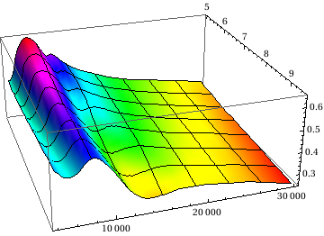
I have a 3 column list of data points. The first two columns correspond to x and y coordinates, with data points creating a surface in the z direction from column 3. This gives me a nice wavy surface.
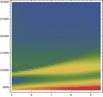
I have a separate file of corresponding error values (chi) which amounts to a similar 3 columns: same x and y coordinates with chi values for each point in my data file. With this file, I've created a very nice (read: adequate) density plot, to show in 2 dimensions, via shading, the variation of chi across the parameter space.
What I'd LIKE to do, is then use this 2D representation to shade the 3D plot, sort of like a "hot" and "cold" graph so I can visualize where the errors tend to be highest and lowest, while easily associating them with my data.
Any ideas? Much appreciated!
Edit: Adding code and plots for clarity.
`ListDensityPlot[gchi[[All, {1, 2, 3}]],ColorFunction -> "DarkRainbow"]`

These are the colors I'd like plotted on the following 3D plot (of different values). The colors vary by value from blue(low) to red(high).
`ListPlot3D[{gband[[All, {1, 2, 3}]]}, PlotRange -> Full, Mesh -> 6,ColorFunction -> Function[{gchix, gchiy, gchiz}, Hue[gchiz]]]`

This is the graph of "found" values for the functions I'm fitting. They're over the same space (x,y) coords as the density plot above, and here, the z components represent data points.
I'd like to color this 3D graph by a projection of the 2D density plot (of different values z, same values x,y) onto the rendered surface. Arbitrary color scheme, I just want it to vary by a separate function determined by a separate list of values.
