4
$\begingroup$

I really like when the programs or editors I use have pleasant colors. Sometimes when there's nothing else to do or sometimes when there are very important, but incredibly boring things to do, I find myself tweaking color and font settings to make everything as comfortable as possible for me.

This was one reason why I asked this question some time ago and it is the reason why I really appreciate people like Ethan Schoonover who invented the solorized color palette. Although his colors are nice, you cannot always use them because sometimes your IDE has maybe a color basis you would like to keep because icons and buttons work nice with it. This is the case with the new Dracula theme of IDEA.

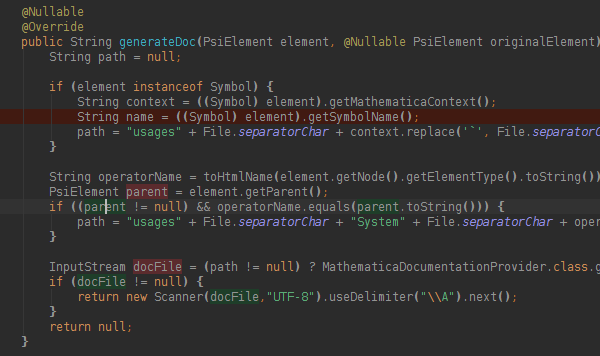
Below is a screenshot of a method. Although the colors look good, there are details which I don't like

  • The annotations (@Nullable) are too bright and the greenish yellow is ugly
  • The method name is a bit too bright
  • The green and red background selection is too colorful for my taste
  • Finally, the normal font-color is a bit too bright to be calming.

enter image description here

Question: Can we use Mathematica (and mathmatics) to create a custom set of colors

  • which can be integrated into an existing color environment
  • which play nicely together
  • where no color catches all attention
$\endgroup$
4
  • $\begingroup$ Have you seen this already? $\endgroup$ Commented Apr 20, 2013 at 1:53
  • 1
    $\begingroup$ Another good resouirce along these lines is the "Kuler" color patterns that some Adobe products use. They have several different ways of balancing color attributes, and the results can be posted back to the site by users kuler.adobe.com/#themes/rating?time=30 $\endgroup$
    – bill s
    Commented Apr 20, 2013 at 5:42
  • $\begingroup$ @halirutan everything seems to be too bright for you. i have a better solution. turn dowb the contrast or brightness on your monitor. o__~ $\endgroup$ Commented Dec 15, 2022 at 20:30
  • $\begingroup$ @bills love the adobe color thingy for building harmonious pallats $\endgroup$ Commented Dec 15, 2022 at 20:36

1 Answer 1

8
$\begingroup$

I'm really keen to see the ideas of other people. Nevertheless, I want to show want I came up with. The approach I show here is hopefully general enough to be used in many situations, but I will use the aforementioned Dracula theme as example.

What I took as basis for this approach was the background color of the editor window. Now I considered several things

  • What never liked is high contrast, for instance white font-color on black background. This clearly hurts my eyes and I could look on the screen for long. Btw, here on Mathematica.SE we have gray text-color too. What I try to achieve is an overall text brightness which is as bright as possible without blinding me (I'm not sure whether blinding is the right word.

  • The main highlighting colors should be of the same brightness. All of them! If a color is brighter it draws more attention which is not wanted because we already have colors to draw attention.

  • The colors should have a certain difference feeling when you look at them. What I use here is the following: when you sort the colors, the difference between two neighboring colors feel equal throughout the palette.

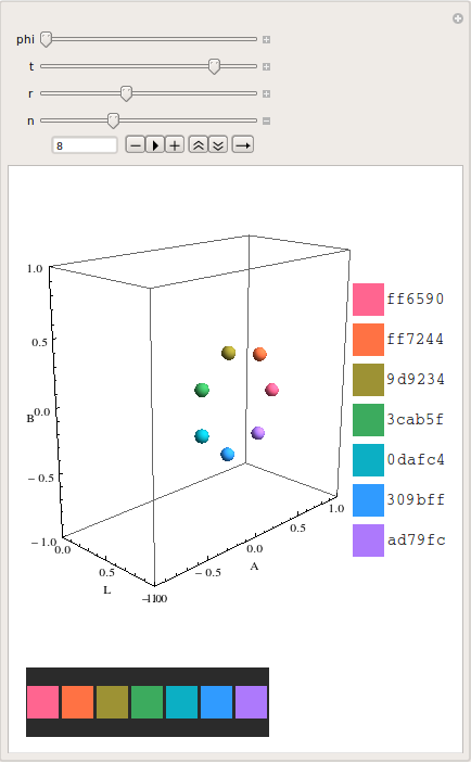
With this in mind, I wrote a small Manipulate which uses the "LAB" color-space to create a set of colors. The advantage of "LAB" is that it is perceptual uniform which means that distances in the color-space are correlated to the perceptual differences. With this, we can easily create highlighting colors, where no color is perceptually preferred.

Long story short: In the following vb is the "LAB" value of IDEA's background color. t controls the brightness. If if is 1, we have the same brightness as the background-color. n creates a circle of n-1 color-points which are located around vb*t with a radius of r. With phi you can adjust the color-point positions.
enter image description here

The visualization gives a Graphics3D showing the color-points in the "LAB" space, a bar with html color codes attached and a preview with background. Using this, I started at the background color and chose the foreground color of the text first. Then I adjusted r to how colorful I wanted the colors to be.

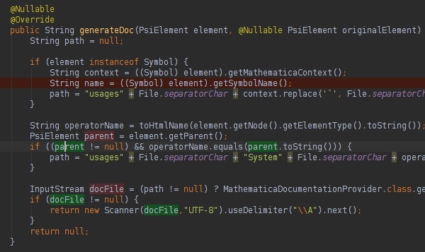
Using this I came up with the following (first the original colors, then the adjusted ones). The differences are very subtle but I think the result is more consistent because of the equal brightness.

enter image description here enter image description here

Here the code

Manipulate[
 Module[{
   data = 
    Table[r {0, Cos[phi], Sin[phi]}, {phi, 0, 2 Pi - 2 Pi/(n - 1), 
      2 Pi/(n - 1)}],
   vb = {0.481, 0, 0}, trans, toHtml},
  trans[phi_, v_, pt_] := 
   Composition[TranslationTransform[v], 
     RotationTransform[phi, {1, 0, 0}]][pt];
  toHtml[rgb_List] := StringJoin[IntegerString[Round[255 rgb], 16, 2]];
  Column[{
    Row[{
      Graphics3D[{RGBColor@
           ColorConvert[trans[phi, t vb, #], "LAB" -> "RGB"], 
          Sphere[trans[phi, t vb, #], .05]} & /@ data, 
       PlotRange -> {{0, 1}, {-1, 1}, {-1, 1}}, Axes -> True, 
       AxesLabel -> {"L", "A", "B"}, ImageSize -> 300, 
       Lighting -> "Neutral"],
      Column[
       Row[{Graphics[{RGBColor @@ #, Rectangle[]}, 
            ImageSize -> {32, 32}], 
           toHtml[#]}] & /@ (ColorConvert[trans[phi, t vb, #], 
            "LAB" -> "RGB"] & /@ data)
       ]
      }],
    Row[Graphics[{RGBColor@
          ColorConvert[trans[phi, t vb, #], "LAB" -> "RGB"], 
         Rectangle[]}, ImageSize -> {32, 64}] & /@ data,
     Background -> (RGBColor @@ ColorConvert[vb, "LAB" -> "RGB"])]
    }]
  ],

 {phi, 0, 2 Pi},
 {{t, 1}, 0, 2},
 {{r, .2}, 0, 1},
 {{n, 10}, 2, 20, 1}]
$\endgroup$
5
  • $\begingroup$ Tiny note: IntegerString[] is listable, and StringJoin[] is sufficiently smart, so: toHtml[rgb_List] := StringJoin[IntegerString[Round[255 rgb], 16, 2]]. $\endgroup$ Commented Apr 20, 2013 at 2:34
  • 1
    $\begingroup$ Thanks, I edited it. The code is still the hack I started with, so don't be surprised if you find many more of such things. $\endgroup$
    – halirutan
    Commented Apr 20, 2013 at 2:37
  • 1
    $\begingroup$ +1 This is a nice idea. A suggestion is to have text samples on a background rather than (or as well as) bigger swatches of color - context makes all the difference to color perception, as I see it :) $\endgroup$
    – cormullion
    Commented Apr 20, 2013 at 8:06
  • $\begingroup$ @cormullion Yes, this is a great idea and I thought about that too, but I think there is some work to be done. When I would use text for this, that I would like to be able to use a real code sample and I would like to be able to specify the color for each keyword/variable/... so get a feeling for the final outcome. $\endgroup$
    – halirutan
    Commented Apr 20, 2013 at 10:05
  • $\begingroup$ @halirutan i've always enjoyed to read your answers and as well your questions, but this specific one and your answer knights you. tip of the hat. $\endgroup$
    – Stefan
    Commented Apr 20, 2013 at 23:11

Your Answer

By clicking “Post Your Answer”, you agree to our terms of service and acknowledge you have read our privacy policy.

Not the answer you're looking for? Browse other questions tagged or ask your own question.